Actually
Case Study
PROJECT OVERVIEW
Client
Actually is a successfully operated online premarital counseling service provider with a modern approach to couples therapy. As they are growing and planning to introduce more services, they want to create an “entry point” for the brand, that will build the bridge from social media platforms to the website
Initial task:
Destigmatize couples therapy and increase users’ awareness, reach, and conversion
Project timeline:
3 weeks
Team:
Caitlyn Torres
Al Arabshahi
Elena Kozlovska
My Role:
UX Research Lead
UX/UI Design Support
Deliverables:
Hi-fi design of quiz
Landing page and signup flow redesign
DISCOVERY AND RESEARCH
Interview with stakeholder and therapist
We started the project by talking to Actually co-founder and one of its leading therapists. The main takeaways:
There is still a lot of stigma around the mental health topic, and doing therapy, especially among men.
Feeling secure and engaged with fun activities helps clients to open up to consultation sessions.
The current clients’ demographic is “the modern couple” - young millennials.
The majority of clients are coming to the website through Instagram (where they currently have the most engaged audience) or from referrals.
COMPETITIVE ANALYSIS
Who else is on the market?
We started the research phase with the competitive analysis to learn about the other players in this market and what features do they offer compared to Actually.
As seen on, Testimonials and Reviews to build trust with users
How it works and a step-by-step description of the sigh-up process to clarify the process and let users make informed decisions
USER RESEARCH
Screener survey
The next step was learning more about the potential users' expectations and attitudes towards couples counseling. We reached out to 34 people aged 18 to 55 years old, with the majority of respondents being 26-35 years old, which represents the demographic of Actually clients.
In-depth interviews
We conducted 9 interviews with millennials with the age range between 23-37 years old.
4 of them have attended couples therapy in the past, and 5 haven’t.
Our main goal here was to learn
How people learn about their and their partners’ personalities,
Their expectations and motives for using couples therapy, and
What prevents people from using couples counseling?
Affinity map is showing the trends
Affinity mapping helped us to analyze the interview results, and see the main patterns.
User interview takeaways:
People see communication as the key to success in relationships. They want to be heard, understood and feel confident in their relationship.
People love to learn new things about themselves and their partner’s personality, by spending time together and doing fun engaging couples activities like quizzes, which they also use as a “starting point” in conversations about their relationship.
People still feel a lot of stigma around having therapy, but a lot of young people see couples therapy helpful in preventing future misunderstandings and providing a mediator in difficult conversations.
In most cases, users would prefer using a desktop for tasks like looking for a therapist or having a therapist consultation.
Personas represent Actually major user groups
Based on the information we gathered from interviews with stakeholders, therapists and users, we created 3 personas that reflect 3 main categories of current Actually clients.
USABILITY CHECK
Heuristic evaluation according to Don Norman’s Principles
We wanted to address the problem of increasing conversion holistically. So, besides creating the online activity to attract new users to the website, we wanted to ensure that the main user flows on the website are clear and intuitive for the users.
The heuristic evaluation helped us to identify the main usability problems.
There are five areas where the current website can be improved, with the following 3 being the priority: flexibility & efficiency of use, consistency to standards, and aesthetic & minimalist design
flexibility and efficiency of use (vague information, unclear sign-in process)
consistency to standards (video starts autoplay, multiple internal inconsistencies, unconventional footer)
aesthetic and minimalist design (text-heavy landing page, unclear service description)
How do users see the current website?
In order to learn what pain points users can encounter when they first visit the website, we conducted usability testing. We showed the Actually website to 9 people who haven’t seen it before, and asked them to perform the same tasks:
Find out what the website is about
Check the price
And book the service
The results of usability testing were consistent with the heuristic evaluation, which confirmed the necessity of design changes.
DEFINING THE PROBLEM SPACE
In order to have strong happy relationships, couples need awareness about modern, engaging, and de-stigmatized ways to discuss their relationships and clear and easy access to them.
BRAINSTORMING
How might we?
Summarizing all the research we’ve conducted, we started brainstorming the solution that would hit both the user and business goals. We tasked ourselves with the following questions:
How might we de-stigmatize people’s attitudes towards premarital counseling?
How might we increase people’s awareness and reach about Actually services?
How might we build the bridge to connect Instagram users with Actually website and increase the conversion?
INTRODUCING THE SOLUTION
Introduce fun and engaging quiz that will help people to learn about their and their partners’ personalities, de-stigmatize their attitude towards couples therapy, and build the bridge from the Actually Instagram page to their website
Reorganize and improve the website to keep users’ engagement, build trust and motivate them to sign up for couples therapy with Actually
Our research showed that in terms of platforms — the best solution is to keep the responsive website design. While a lot of clients are coming from Instagram, another big part of clients is from recommendations, and a lot of users prefer to use desktop for therapy calls and/or don’t use social media.
CREATING THE QUIZ
Gottman’s Four Horsemen & their antidotes
We needed to create an online activity that users would want to share with others, and therefore share about Actually. According to Psychological Science, there are 4 main components that make content shareable:
USEFUL
ENTERTAINING
INSPIRING
EVOKING STRONG EMOTIONS
Our research showed that people like taking quizzes for being an easy way to learn about themselves and great ice-breakers to get to know one another or to start a conversation for couples. We did the competitive analysis of existing most popular personality tests and learned that most of them are long and time-consuming.
There is room in the market for a personality quiz that encourages users to think about who they are as a partner while being modern and light, so we needed to create such a quiz for Actually.
Previous research showed that Gottman’s Four Horsemen test was effective in studying communication behaviors in couples, however, negative attributes may leave users feeling bad.
In order to align with Actually’s brand, we decided to opt for positive emotions and to proceed with the four horsemen antidotes. These attributes can evoke positive emotions while being useful, entertaining and let the users leave the quiz feeling more knowledgeable and in high spirits.
Using that data we personified each antidote. This helped us to build unique responses for the quiz based on each persona.
What we got was a family of test results that are positive behavioral characteristics to Gottman’s 4 horsemen of relationships. It’s aimed to show couples their communication patterns in a warm and friendly tone.
WEBSITE REDESIGN
Bringing ideas to life
Our goal was to improve the user experience and engagement starting from the quiz, to navigating to the website and all the way to the onboarding flow. The next step was to reorganize and improve the website, based on the user testing results.
Style Tyle
The client provided us with the font and color palette to be used. However, in order to keep the website gender-neutral, we blended together suggested pink and blue colors into a gradient and introduced purple color as a secondary accent color. These made the website look brighter and stand out.
FROM LO- TO HI-FIDELITY
Preliminary sketching
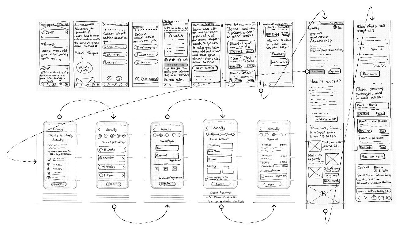
We started with Design studio to quickly generate ideas and prioritize the features for the redesign. Then the preliminary sketches were combined into a lo-fi paper prototype.
Lo-fi paper prototype
Mid- & hi-fidelity prototyping
Quiz evolution from lo- to hi-fi
Home page evolution from lo- to hi-fi
TEST & ITERATION
Are we building things right?
We conducted user testing at multiple stages of the design process to ensure redesign is achieving the project goals.
Promo code page
Underline removed to avoid confusion
Card size increased to add more space
Background blur was added to make the card stand out
Result page
Title was bolded and centered to draw users’ attention
Icons for sharing are made larger
UX writing improved
Packages
Program duration was the main concern for many users
Packages names were changed to represent the difference
REDESIGN SUMMARY
Quiz flow design
Onboarding flow redesign
Landing page redesign
NEXT STEPS & REFLECTION
Consideration for the future:
Do more user testing for the quiz & iteration based on the feedback
Introduce the “As seen on” and “Reviews” sections to build users’ trust and loyalty
Improve other pages on the website as “How it works”, “Learn more”, and “Career” sections, to continue improving users’ experience from using the website.
Reflections
This was a fascinating project that proves that UX doesn’t lay in just one platform, instead - it builds bridges between different platforms and connects users with the provider. A holistic approach to solving problems, thinking outside of the box, and connecting platforms to build a strong brand were the main lessons to polish. Also, having design constraints was challenging at times, but in the end, resulted in more inclusive and creative design decisions that helped us reach both the users’ and the business goals.
More projects:
Menti
Challenge: Address workplace stress for medical professionals by providing them with a safe space for anonymous discussions and access to trusted mental health resources.
MNOC
Challenge: Enhance PM teams' efficiency by resolving usability issues, optimizing task performance, and introducing tailored functionality to cater to their specific work tasks..


