ProfitProf Case Study
PROJECT OVERVIEW
Hackathon prompt and overview:
For this 3 days hackathon, we worked in a team of designers and developers to create a solution for the prompt “Accessible money management”. Proud to admit that our project was the winner.
Project timeline:
3 days
UX Design team:
Alireza Arabshahi
Matthew Lalanne
Elena Kozlovska
Development team:
Tony Villa
Leonard Moses
Jordan Lee
Deliverables:
Desktop web app Hi-fi prototype
Functional working demo
Presentation deck
INITIAL BRAINSTORMING
Meet the team and set a plan for success
We had less than 3 days not only to design but also to develop a product demo that is functional, AND useful, in a team of designers and developers who haven’t worked together yet. The only way to achieve all these goals in such a limited timeline was through strong collaboration. So, we started by introducing ourselves and our key design and coding skills, as we wanted to ensure that we leverage our strengths to the maximum.
Also, we agreed to use Figma and Zeplin to hand off the design to the developers. It was also important to create a clear style tyle and usable component library to align and speed up the development process.
RESEARCH
Working fast doesn’t mean skipping the research
Even though we were working in a limited time frame, we still wanted to make sure we are designing the right thing, so we started with the research.
We decided on the following research methods:
Since the initial prompt given for the hackathon was very broad, we wanted to narrow it down. We used our teams for facilitating a focus group and brainstorming questions, such as:
What accessible money management is,
What tools and technics are useful for effective budgeting,
What can we offer to help people with money management?
From this discussion, we learned that while there are a lot of tools for budgeting on the market, a lot of them are time-consuming. The screener survey results also showed people are looking for easy and effective ways of money management and tracking their budgets and financial goals.
From the screener survey, we also learned that people are interested in topics related to savings and investments, and in setting financial goals (short and mid-term in most cases).
COMPETITIVE ANALYSIS
Prioritizing possible features based on competitors’ evaluation
The research of other financial management tools showed that the main features offered are data visualization (like showing your financial graphs in Google Spreadsheets), and the import of financial transactions directly from the bank for time efficiency.
KEY FEATURES
From technical constraints through collaboration to success
Implementing the feature of connecting bank accounts was not an option for such a short-term project because of security reasons. However, as always, constraints boost creativity - so for this stage of the project we decided to focus on other important aspects of money management:
defining “fixed” vs “non-fixed” expenses
setting up financial goals
“Fixed” expenses
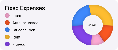
The goal of differentiating expenses into “fixed” and “non-fixed” is simple - fixed expenses (like rent, insurance, or utility bills) are vital and hard to avoid/reduce, while “non-fixed” expenses are money spent on nonessential categories and can show on what expenses users can save if needed to.
Financial goals
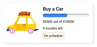
Studies show that people who very vividly describe or picture their goals are anywhere from 1.2 to 1.4 times more likely to successfully accomplish their goals. Other key factors in achieving goals are motivation and progress monitoring.
PROBLEM STATEMENT
People need a simple way to differentiate reoccurring expenses from unfixed, and to set financial goals visually with having a deadline in order to stay informed, committed, motivated, and improve their financial situation.
IDEATION
Keep everyone on the same page
We developed a user flow to visually outline what steps users need to take to set a financial goal to stay on track during our design phase. This also helped us to define
DESIGN PROCESS
From sketches to hi-fi
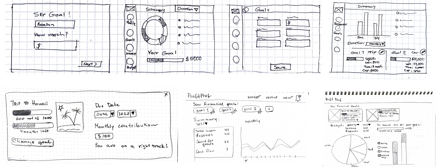
We facilitated a design studio within our UX design team in order to generate multiple ideas in a limited time frame.
Mid-fidelity wireframes based on the sketches design studio brainstorming.
IDEATION
Design improvements through collaboration
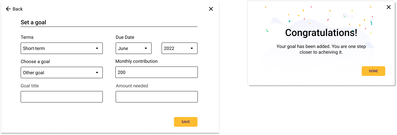
After presenting the design to the dev team, some design improvements were made based on their feedback. We adjusted the flow of a goal creation from 3 steps to 1. This made the dev process easier, and the flow became more clear to the user.
The original version contained 3 steps
After 1st iteration, one step was eliminated - user is able to choose the goal from a drop-down menu instead of choosing it on a separate screen.
Taking into account time constraints for the development, during the 2nd iteration we combined all steps in one - the user is now able to select the goal term, choose a goal, and set the rest of the parameters on one screen. Also at the current stage, we eliminated the option to upload your own image to the goal, instead, the image is assigned automatically according to the goal type selected. However, we want to implement the image upload feature during the next stages of development.
Final prototype
The final prototype included a sign-in flow, a landing page summary, and the flow of setting a financial goal.
Sign in flow and the landing page
Goals page to view the achieved and current goals, as well as view the goal details.
Reflection
This project was a great experience. By dividing the roles, establishing clear communication, and working in collaboration - we were able not only to create a useful and functional design but also make sure the design can realistically be built during the time we had. If time allowed, we also wanted to conduct usability testing for our final prototype before heading it to the development team. However, as an alternative, we ideated based on our teammates’ feedback.
More projects
Actually
Challenge: Design a solution to engage the Instagram audience and increase conversion to the client’s website. Improve user experience by redesigning landing page and onboarding flow.
Menti
Challenge: Provide medical professionals with a safe space for anonymous discussions and access to trusted mental health resources.


